Good business journalism requires many skills: research, interviewing and analysis. These days, you need to add data visualizations.
A lot of business reporting involves going through data, uncovering trends and patterns, and then presenting the results to an audience. When you’re working with masses of data, trying to understand it requires more than flipping through tables of numbers. Learning how to create visualization tools can help you better understand what is in front of you, even if you never show the graphics to anyone else.
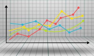
However, you likely will find times when graphics can help tell the story. Words are great, but with visually driven online platforms—as well as the graphic requirements of print and video—you need other ways to reach an audience. For example, I created a graph showing Apple’s quarterly sales of iPhones (above). It allowed me to present patterns in the rise and fall of sales that countered conclusions many other journalists embraced. While others wrote stories about the dire drop in unit sales, my graph showed that sales would most likely rise again in the next quarter.
Whether you create graphs for yourself, final images to include in stories or even rough material to pass on to an art department, you need to be comfortable with tools that can make reporting more dynamic. Here are a few to consider.
Tableau
Tableau is one of the main tools used by data journalists, data scientists and even some art departments. You can connect to multiple sources of data and build complex graphic representations of the information. Tableau can be an expensive tool, but there is a free version called Tableau Public. You save projects into a cloud environment and gain access to resources, such as how-to video training and sample data sets. This isn’t something you’ll master easily, but once you get the hang of it, it’s great. I did a graph of median income by state and then was able to make the bars one color if the state had voted Democratic in 2016 or another color if it voted Republican.
Excel
Microsoft’s spreadsheet has been around for decades and it comes with a good number of built-in graph options. You can create 2-D and 3-D varieties, add titles and data legends, specify labels for data and axes, and even create trend lines or high-low lines that can show the high and low values of a variable at a given time. Excel is one of the fastest ways of getting from data to something demonstrable, but it doesn’t allow you to save a chart as a graphics file. A decent screen capture program will let you snag what you see on the screen and turn it into a JPEG, PNG, or GIF file that should work online. Or you can right click the graph, choose Copy, and then paste it into another application that can save the results as an image file.
RawGraphs
Designed as a “missing link between spreadsheets and data visualization,” RawGraphs lets you paste data into the site, choose one of many available layouts and export “semifinished visualizations” that you can import into a graphics editor and further refine.
Google MyMaps
Google has some solid tools for creating maps and including data in them to form interactive displays that you can then embed in a story. The directions on how to use the tool will be helpful.


