As business journalists, we handle scores of data and do our best to use those figures and statistics to both build and bolster articles.
Some of the benefits from the ever-expanding digital world include not only the increasing amount of information, but also the emergence of unique ways to visualize data.
I’ve found that Google Fusion Tables is one, relatively user-friendly, avenue to take shallow and deep sets of data and craft them in ways that are easy to read and digest. One benefit of Google Fusion Tables is the “fusion” element. There are reams of existing tables of public data – including geographic vector data – that could be used to enhance your table.
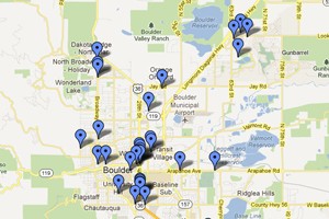
In my work at the Daily Camera in Boulder, I’ve used Google Fusion to create interactive maps to detail impending developments, patents granted across all U.S. counties and local craft breweries and breweries in development.
Need a visual? Check out my tutorial below. It’s a step-by-step guide detailing the building of a simple Google Fusion Table interactive map on U.S. patent data. (Depending on the device you’re using, it might be easier to read by entering into full screen.)
I’m a newbie. For the past few months I’ve simply scratched the surface of incorporating Google Fusion into my stories. But a handful of journalists have been utilizing the tool much longer and they shared advice for business journalists looking to dive in.
Maximize the base data
Sandra Fish, a Colorado-based journalist and journalism instructor, specializes in data analysis and interactive reporting. She has utilized Google Fusion for a several years.
“If you’re already using Google spreadsheets, you are almost using Google Fusion Tables,” said Fish, who writes for The Washington Post and other publications in addition to teaching at the University of Colorado. “It’s just one more step into that.”
Primarily a political reporter, Fish has used Google Fusion to create interactive maps and charts that detail information such as the number of female Congress members over time.
“There are so many opportunities for a business reporter … especially in real estate,” she said.
Some quick ways to integrate Google Fusion Tables into everyday reporting include crafting tables, line graphs or interactive maps for topics such as unemployment rates, gasoline prices, stock prices and properties sold.
“You need that base data, though, to create this table that has richer information than you would get from a Google map that has just the addresses,” she said.
For example, Google Fusion allowed a group of Fish’s students who were working as part of the newly launched CU Journalism News Service to create an interactive map of the properties burned in the Waldo Canyon Fire in Colorado Springs.
Fish shared the following nuggets of advice for business journos just starting to work with Google Fusion Tables:
- Check out tutorials (such as this one from Michelle Minkoff, this presentation from IRE, and this post from forjournalists.com) and also what other people have done and how they have incorporate the database visualizations.
- Think about topics that you report on that are relevant to people that also include numbers.
- Attend a National Institute for Computer Assisted Reporting (NICAR) conference to learn skills for data-heavy reporting.
Using the tool to spot patterns
At National Public Radio, a web team developed a plug-in that allows its StateImpact reporters to build Google Fusion Tables inside WordPress.
The addition of the visual elements assist in the broader StateImpact goals of providing data-driven, enterprise reporting on topics related to the economy and government on state levels, said Amanda Loder, NPR’s StateImpact reporter for New Hampshire.
“When you have a very small government that isn’t able to keep track of a lot of things, whatever data you can bring to the table is a huge thing,” she said.
Some of Loder’s articles that have incorporated Google Fusion Tables include pieces on the state’s vacation homes and home health care pay.
The tables and maps are useful in helping to see patterns and also could be used to find stories and sources, she said. For example, she added, mapping the concentration of vacation homes in New Hampshire could show which townships and populations are reliant on the boom-and-bust tourism cycle.
Intensity and heat maps can draw the eye and draw attention to activities within a certain area and quickly show that “something either really good or really bad is happening in this area,” she said.
Some additional tips from Loder include:
- For comprehensive datasets for business reporting, visit the U.S. Census site.
- You don’t need to incorporate a map with every story. “Do it when it makes sense to do it,” she said. “If a table tells the story better, just use the table.”
Understand the limitations
Lucas Timmons, a data journalist based in Canada, has used Google Fusion Tables for about two years and appreciates some of the functionality. However, there are some limitations, he said.
“The benefits of (Fusion Tables) are that it’s free and has a pretty low learning curve. It also can make use of the Google APIs and works well with JavaScript, so you can build almost any type of visualization you want,” Timmons wrote in an e-mail.
“The downsides are that there is a 250 MB limit on data, the are few makers available for use on the map, dealing with the data in Fusion Tables can be cumbersome, and you’re tethered to Google with no guarantee the service will always be free, or will always be supported.”
Some additional links to Google Fusion resources for journalists: Data Journalism Blog, Online News Association and also Google’s Fusion Tables example gallery.


