I’ve come across some new (at least to me) tools that are great for reporters doing data work as part of their business journalism. Here they are. Give them a try and get in touch to say how you find them.
Adobe PDF extractors
I recently was writing a piece on politics, looking at election machines in Kentucky. One question was how the number of potential voters per machine varied by county.
The state’s data was there, but in PDF form. Sometimes you can copy data and then paste it in, retaining formatting. But a few minutes of trying to copy columns into spreadsheets and realizing that there was still a lot of typing ahead, I checked for any tool that might make it easier.
Adobe came through. For $23 a year, I got access to a set of conversion tools. One took a PDF with table information and turned it into an Excel spreadsheet. Figuring that the money was a small gamble, I paid and tried it. Marvelous. In a matter of minutes, each PDF became a spreadsheet and I saved probably a good hour or two of data entry.
St. Louis Fed’s Mapping
I love the FRED site of the Federal Reserve Bank of St. Louis. There is a huge number of economic data sources that can help any business journalist’s reporting and provide material for graphics.
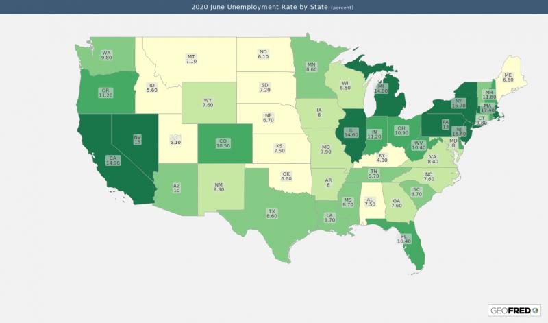
The St. Louis Fed recently announced a new mapping tool called GEOFRED. For some data that has geographic ties, you can immediately get maps, or create your own from thousands of data series.
The site has tutorials and you can create a free account that lets you save, share, download, or print maps. Here’s an example of one showing June 2020 unemployment rates by state.

Datawrapper
This isn’t new; I’ve been using it for a couple of years. And while I found it irritating at first, Datawrapper has become a handy choice. I’ve seen multiple news outlets using it, plus I have my own personal (free, thanks) account that lets me create and download many types of graphics.
You can add charts, graphs, and tables by uploading data. (A hint: things started working better for me when I put all data into columns rather than rows.) A series of steps brings you through choosing the type of graphic you want, tailoring the display, making customized changes, and ultimately downloading the results so you can include them in a story. Corporate accounts let you host the image on the Datawrapper site and embed the results, so that if your data ever changes, so does the displayed graph. No need to edit and upload a new version of a graphic.


