
Mark Twain noted that there are “lies, damned lies, and statistics.” Fraud with numbers is something business journalists should always be alert to. But there are gold-standard statistics that no one outside the lunatic fringe questions. And the top place to find them is on the FRED site run by the Federal Reserve Bank of St. Louis.
Specifically, FRED offers 224,000 time series sets of data — everything from gross domestic product and unemployment to economic statistics for states and metropolitan areas. FRED is an essential tool for every business reporter. It is an easy to use site with friendly navigation, tutorials and even an app for your tablet and smart phone.
I use FRED for all sorts of reporting.
It is a life saver when the editor asks for chartables. Not only does it offer data over the years, but it can be downloaded into an Excel spreadsheet for the art department.
The graphics can also be directly downloaded as a jpg or other extension to be embedded in a blog, as I did with this online column smacking down a boneheaded AP story on the economy.
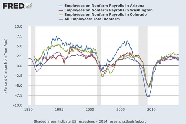
Click on the “categories” link and then go to “U.S. regional data.” It tracks more than 85,000 data points for states and metro areas. Want to know the employees on non-farm payrolls in Arizona going back to 1990? FRED’s got you covered.
The program allows you to see the data in different ways. Pull down the “units” menu and you can, for example, see employment change as a percentage compared to the previous year. This tells me that Arizona’s employment is not only lower in nominal terms but that the labor-market recovery is much weaker this time than in previous expansions.
In other words, FRED not only offers graphics but news.
In addition, you can add data for context (click on “add data series”). In the chart above, I compared Arizona to two other Western states as well as the national average. It’s a weak recovery for everybody. Lately, Arizona has been slightly trailing the peers I included. The chart also shows how this house-building dependent state fell much further in the Great Recession.
Always be careful in choosing how your data are presented. In other words, seasonally adjusted is usually preferred, but in some cases you must check the box and click on that link to get it.
A new tool allows users to map the data, too. In addition, the researchers at the St. Louis Fed run a FRED blog with explanations and commentary on important data releases.
I’m a word person and believe in the power of writing. But graphics carry their own special power, especially when the data are unimpeachable. FRED helps me understand history, context and trends. It’s worth your time to spend some hours getting to know the site and becoming familiar with how to navigate and download. You’ll be glad you made friends with FRED.