Maps are so common that we forget the value and wealth of information they provide. Location on the planet and proximity to other places are just the basic information we get from looking at a map. Thankfully, there are many tools for reporters to make their own maps and add critical context to their stories.
Google My Maps
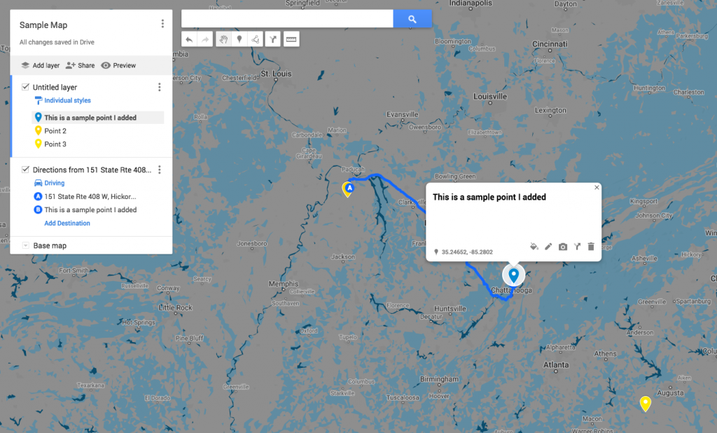
Google Maps has become a ubiquitous way for people to understand the world around them. But these maps are also customizable and can be exported and embedded onto other webpages.
My Maps is intuitive and great for doing simple things like adding points and driving routes between them. You can also upload your own CSV, XLSX, KML or GPX files to get your own layers of data onto the map.
My Maps also allows you to create 3D maps by integrating with Google Earth. Like other Google products (Docs, Sheets, Slides) these maps are accessible within your account and on the Google Drive.
Mapbox
Mapbox is another free, online platform to create all kinds of maps; from something simple, to one with multiple layers of more data. Of the items discussed in this post, Mapbox is the most versatile and thus most complicated.
Mapbox is cool because it already has some data loaded into the studio. For example, in the image below, I have selected voter turnout data for the 2016 presidential election. By adjusting some of the color settings I got this:
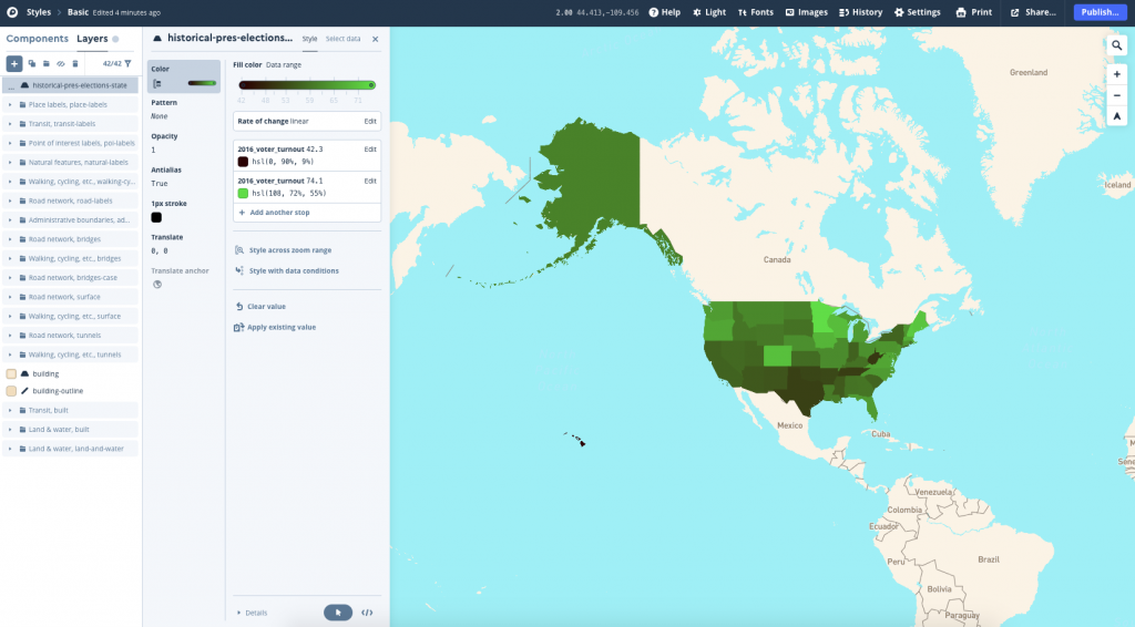
Again, Mapbox has a lot more built-in functionality than some other options. Which can be daunting, but it also allows you to create exactly what you want.
Flourish Studio
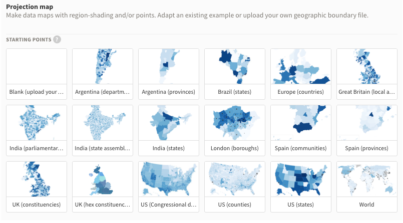
Flourish Studio is an online tool for creating data visualizations and maps. With a free account, all your work is public to other users, but on a private account your work can be private and free of the Flourish logo.
Flourish has lots of base maps to work on, and you are able to upload your own if what they have is not what you need. They have customizable arc maps to show movement between locations, point maps to show events, marker maps with icons and a variety of projection maps shown below. Once complete, these maps can be embedded in webpages as interactive features.
As with all these tools, it may take a significant amount of tinkering to get the map to show exactly what you’d like. But Flourish has a wide variety of settings to ensure your map will greatly support the rest of your story.
Additional Tools
QGIS is a free, open-source software that emulates the best mapping softwares around. Q is very versatile and allows for fantastic customization by importing modification packages to the software. Finally, here are a few other tools. These ones require a paid account to access them, but they are the top of the line: ArcGIS, Tableau and Carto.