
When it comes to creating infographics, annotating the data can give you the most bang for your buck, says Catherine Mulbrandon, creator of VisualizingEconomics.com, a website that transforms economic data into infographics. She recently won a grant from the McCormick Foundation to grow her site.
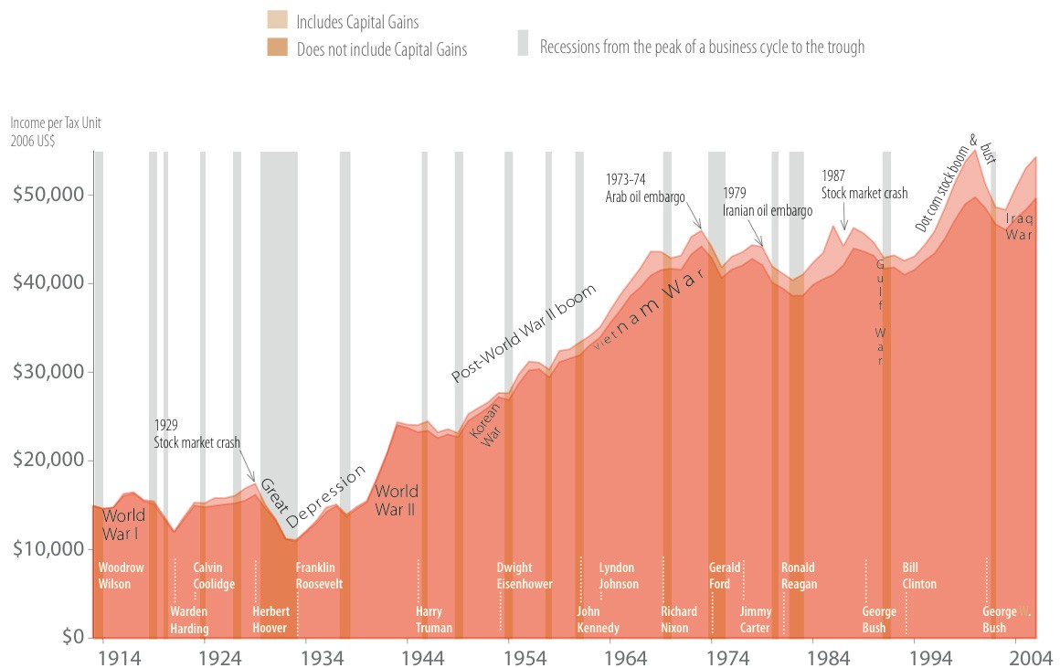
What does annotating the data mean? Adding elements such as timelines and averages to help put the numbers into perspective and tell a story. For instance, in her infographic showing average income in the United States since 1913, she added in presidential terms, global events and recessions to put the income data into perspective. Other examples are in her tax-rate and stock-price growth charts.
Annotating the data is step six of Catherine’s seven-step process for creating infographics. The others are acquire data, parse, filter, visualize, refine and publish.
“I want the infographic to tell a story about the data, but not overwhelm it, so editing becomes very important,” she says. “Show too much, and it becomes visual clutter.”
Today’s Tip: “There is often one important idea that my infographic must convey, but if I am struggling to express it in a sentence, it probably means my infographic isn’t clear either,” Catherine says.
Catherine, who has degrees in economics and interaction design and operates a data-visualization consultancy. shared some of her favorite techniques to ensure clarity in infographics. They are:
- When possible, show the entire historical data series to help people see long-term trends.
- Provide simple statistics such as averages or medians to help people understand what is a large or small value.
- Provide a timeline with historical events that help explain the changes in the values.
- Add another data series to compare to the main data and illustrate the relationship between the two.
- Use visual hierarchy to make the most important information pop in the graphic. For example, make a few important items red or orange and use gray for everything else; bold or increase the size of the text that you want the viewer to read or add white space around this text so it stands out.